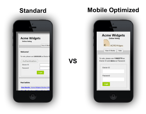
Mobile optimization is crucial in today’s digital landscape, where convenience and accessibility drive voter engagement. By delivering a seamless and consistent experience across all devices, our responsive design ensures that voters can confidently participate in elections from anywhere, at any time. This enhanced usability not only boosts voter satisfaction but also helps increase overall turnout by removing barriers for mobile users.
Users of our online voting system are accessing their ballots from smartphones, tablets and other mobile devices more than ever before. While Simply Voting always worked on a mobile device, today we launched a responsive web design for all our clients' voting websites that is truly mobile-friendly. A responsive web designs adjusts the website according to the type of device and delivers an optimal viewing and interaction experience.
What does this mean for your election? Simply put, voters using a mobile device will not have to zoom, pan or scroll sideways because all the elements on the voting website are properly sized and placed. This makes for easy reading, easy navigation, and easy voting!
By embracing responsive design, we’ve ensured that voters can easily cast their ballots on the go, whether they’re at home, at work, or commuting. This flexibility aligns with the fast-paced, mobile-first world we live in, where user expectations demand speed, simplicity, and accessibility. Our commitment to mobile optimization means that your election website will not only look great but also function flawlessly on any device, empowering voters to participate effortlessly.
Visit our Election Website!


